
Having an online presence is vital for any business, especially in our industry. Today, there are many ways to have an online presence, but your number-one approach must be through your website. Your website is the forefront of your business, especially when a potential new customer is searching online for the nearest contractor or that specific service only your business provides. That next customer is one click away from learning about your business, so you want to ensure you have an effective website prepared to help you grow your customer base.
We understand this can be a challenge, so we’ve put together 5 tips to help ensure your business is prepared to capture your next customer with an effective website.
1. Google My Business
We’ve previously discussed Google My Business. It’s essential for your company. Your customer begins their search on Google, the largest search engine that’s used daily. It puts your business in the forefront of your local customers and ahead of your competitors. It’s a free and easy tool to use that will benefit your business with an online presence, which is absolutely essential. Your next potential customer may not be aware of your business/service, but Google My Business will help by providing your contact information including your phone number, hours of operation, and more importantly your website. It’s an opportunity to make your service stand out, along with its other great benefits. The first step in making sure your site will be effective is by generating more traffic and exposure with Google My Business.
2. Good Design
The design of websites tends to be overlooked, when in reality how it looks is important. You want to be sure you have a professional-looking website that will make a great first impression, and encourages your customers to stay on it longer. If your customers are staying on your website longer, they’re more likely to learn about your services and decide to work with your business.
Take a look at these examples, which website would you prefer to visit:
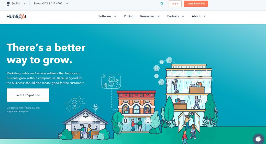
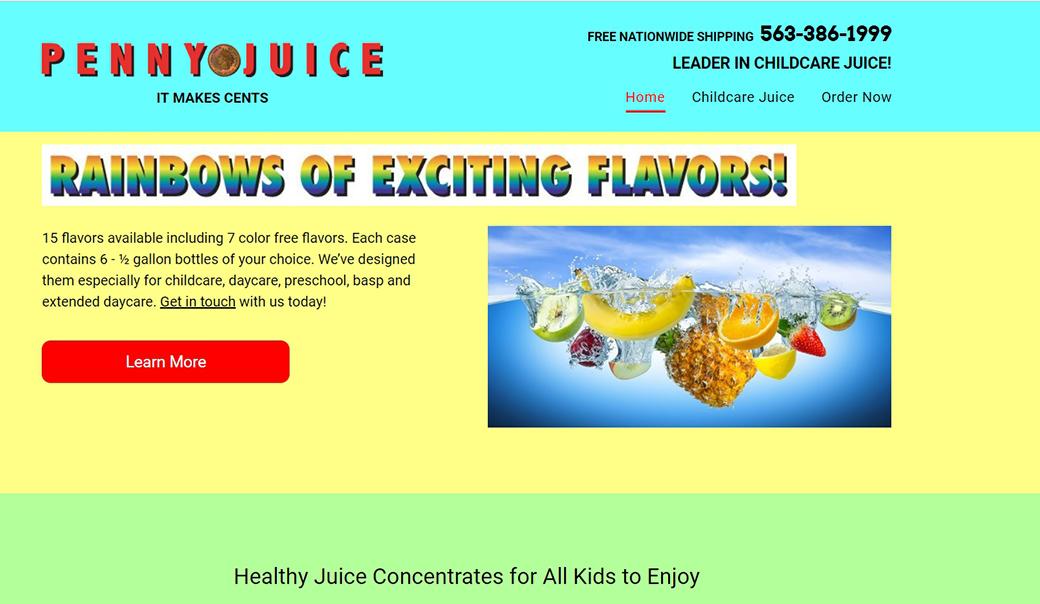
If you choose the website on the left, you’re on the right track. But what makes that website appear professional compared to the site on the right? Here are a few good design elements that differentiate the two:
-
- Color
The website on the left uses a few limited colors, and in a very simple way. They used white text on a blue background which helps make the text easy to read and look neat. Using too many colors can complicate a site and become distracting to customers. The site on the right is using different bright colors which is unnecessary, makes the text a bit difficult to read and the site appear outdated as well. If you’re unsure of what main color to use, stick to a color your audience can associate with your service. If your company focuses on turf services, green would be your choice or blue for irrigation. Remember to keep your use and choice of color simple.
- Color
-
-
- Organization
Depending on what you believe is important to share about your business such as contact information or an option to get a quote, the placement of your content matters. The website on the left placed their contact information, search engine, and log in option aligned together on the top. The important element to notice is the separation between this section and the navigation bar(software, pricing etc.) This helps the website appear organized and professional without any information getting overcrowded. It also helps customers find the information easily without having to take time to scan the website. The website on the right placed the contact information on the top as well, but it’s near the navigation bar which overcrowds that section. There’s nothing to help separate the information, so it will take time for a customer to find out how to contact them, and if it takes time to find information then the customer will leave the site.This may appear to be a subtle element, but it makes a big difference if you want your website to gain the attention of your next customer by making sure the content on your site is organized.
- Organization
- Font
Similar to the color, you want to ensure the choice and size of the font you use is limited. The example on the left uses the same type of font and size throughout the homepage. This helps keep the site appear consistent. The only different size is the title/header, which is good to experiment with in order to help draw attention to a certain section you want to ensure they see. The site on the right uses a couple different sizes when it comes to their font such as the contact information, the “Learn More”, and the statement at the bottom. This will catch the attention of the customer in different directions, and will take up the customer’s time as it’s complicated to follow. It’s important to keep in mind that when customers visit a site, they hope to find the information easily so they can learn more about your business.
-
A well designed, professional-looking website also helps show you’re a professional in our industry that knows what they’re doing. If your website hasn’t been redesigned in years, your customers will question the legitimacy of your business and decide to go to your competitors. So take some time to ensure the design of your website is professional, and up-to-date to help your business capture new customers!
3. Call-To-Action
Once you’ve captured the attention of your customers, adding a Call-To-Action button to your homepage is very useful. A call-to-action button helps your customers indicate what to do next on your website. It can be used to direct them towards viewing your projects, getting a quote, or even downloading a brochure about your company. It’s a very simple but effective method of catching your customer’s eye, and taking action on your site.
Take a look at this example using a Call-To-Action:

4. Blogs/Articles/Content
Blogs are a great approach to reach and capture your customers. Blogging is your chance to show your expertise in our industry. For example, you can talk about great industry tips, what’s going on in the industry, or about a new unique service you provide. Showing customers your expertise is important as this will encourage them to choose your service with confidence. It’s a great opportunity to help show your customers you know what you’re doing when it comes to your service. When sharing your knowledge in the industry, keep in mind to show a bit of your personality to help your customers feel more connected to the business. You want to remind them that they’re hearing from you, and not a machine. You can also help your customers get a better sense of your service by providing before and after images of a project in your blogs! This is your opportunity to show how great your work is and be able to support your expertise in the industry.
Blogs also help S.E.O., which stands for Search Engine Optimization. It is the process of generating traffic from the free/organic search results on search engines such as Google. Google can help display your site on search results based on the simple industry terms you use in your blogs. It pulls information from your blog, and displays relevant information to what your next potential customer is searching for. In order for your blogs to help you generate traffic, make it easier for your audience to find you in their search results by using simple terms such as “weed-killing” or “insect-control”. These are more common than technical industry terms and will ensure your blogs gain exposure, especially when it comes to customers that aren’t familiar with the industry. If you’re unsure about what your audience is searching for, take a look at Google Trends to help you get a better idea of the next topic your blog should be about or what terms to focus on.
Also, keep in mind to update your blog at least twice every month, and only share information relevant to your business/service!
5. Less Is More
When it comes to talking about your business and services on your site, make sure to keep it short and simple. Having too much text on your website can overwhelm your customers, you want to ensure when someone is on your site they’re able to find information without any issues. One of the most important findings is that people scan websites. They come to your website for something specific and they want to find it fast. If they can’t find it quickly (within 7 seconds) they will again move on to your competition. Share information about your business/services that you know is important or commonly asked for when it comes to your customers. Keep these tips in mind when adding information to your site:
- Avoid large blocks of text on the home page. Use short paragraphs, call-outs, and bullets to make scanning easy.
- Simplify your site navigation. Have only one menu and try to limit it to no more than six options.
- Don’t be afraid of white space. If you have too many photos, animations, icons and text on your home page it can become overwhelming. Remove anything unnecessary.
Whether it’s online support, website audits, or design support, Central is the right partner for your business. Our highly experienced Marketing team has decades of experience to help you identify best-practices and implement initiatives that deliver results. We’re ready to help you grow!